Progress over pressure
The system celebrates consistency and personal evolution instead of perfection.
One Co. presents
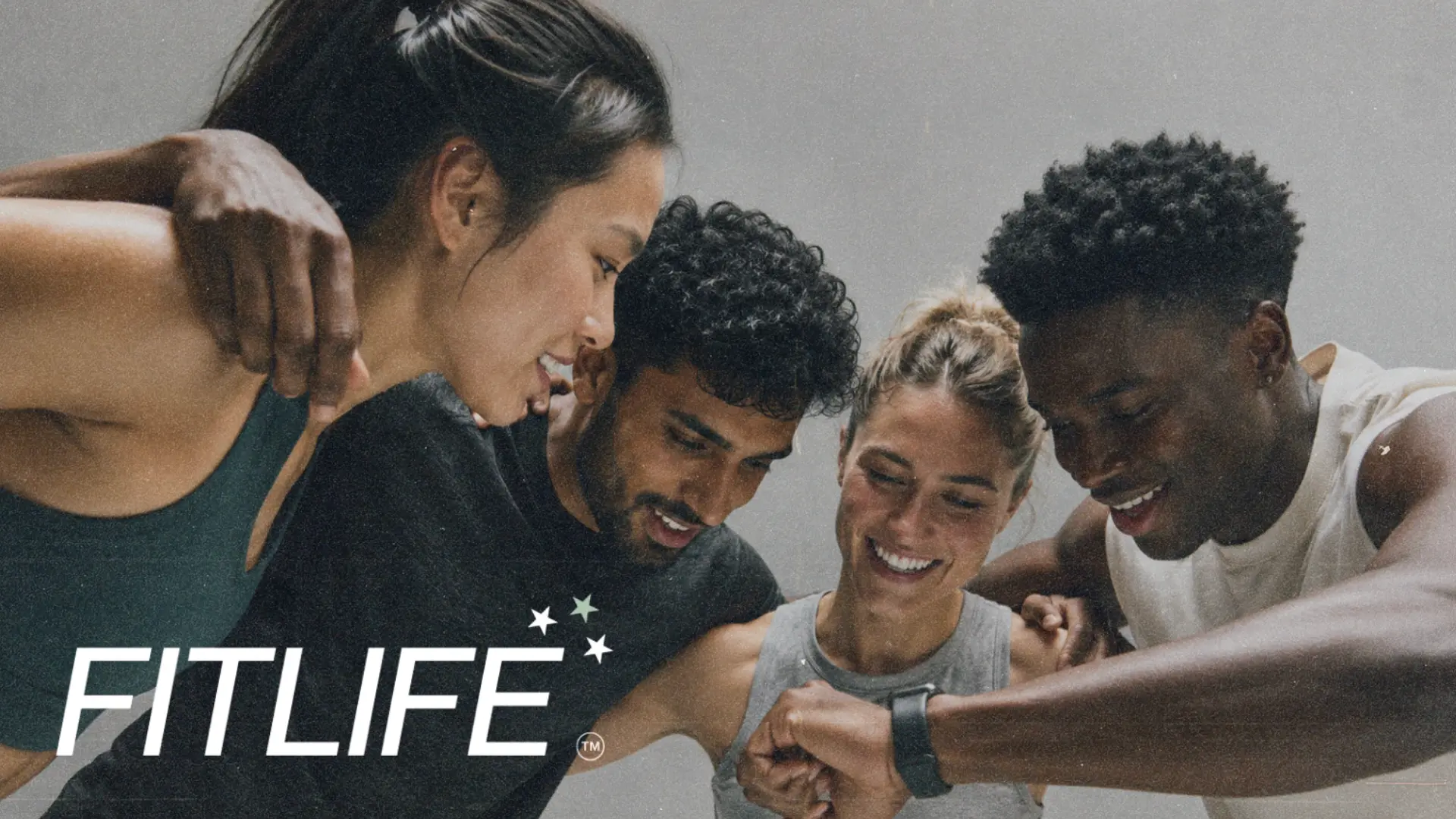
The project
The brand had to hold both intensity and care. It needed to motivate high-performance clients without becoming aggressive, and welcome people beginning their journey without feeling generic.
The idea
The system celebrates consistency and personal evolution instead of perfection.
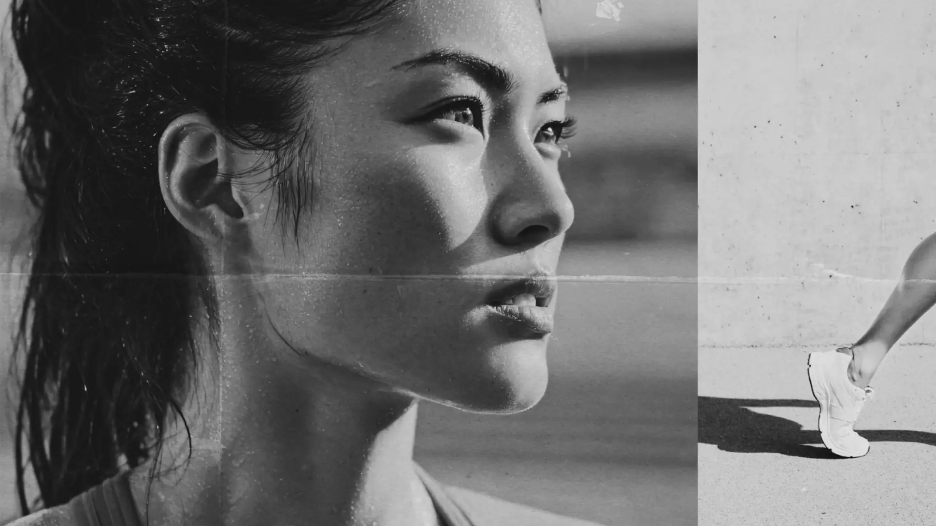
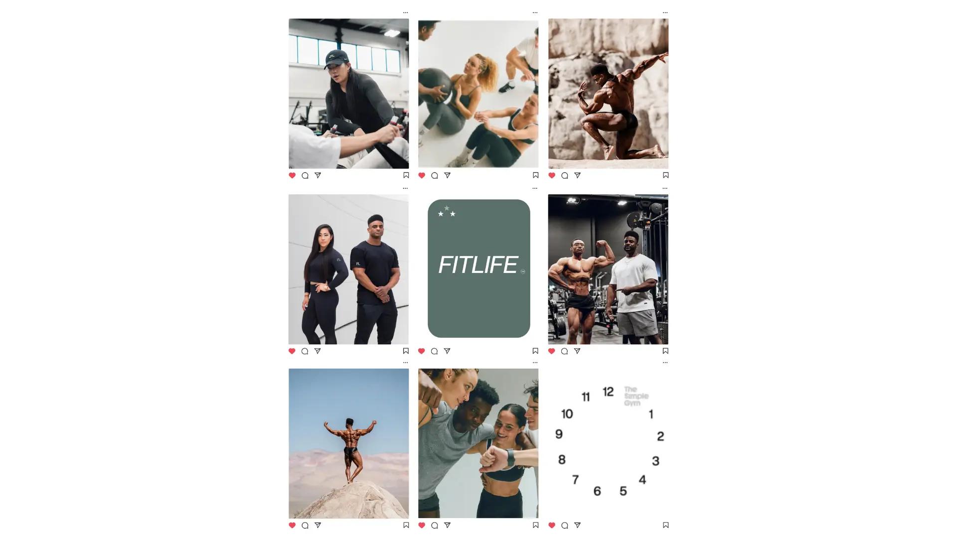
Dynamic crops and directional typography create movement inside a calm visual frame.
Inclusive photography makes performance feel collective, encouraging and real.
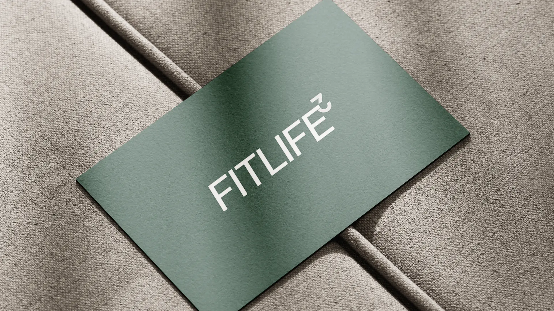
Colour language
Each colour has a clear role: an ownable foundation, a high-energy signal and a supporting neutral range that lets the brand move comfortably between expressive and practical moments.
Mineral#506B61
Forest#1E2A26
Oat#E9E5DC
Chalk#F7F6F2
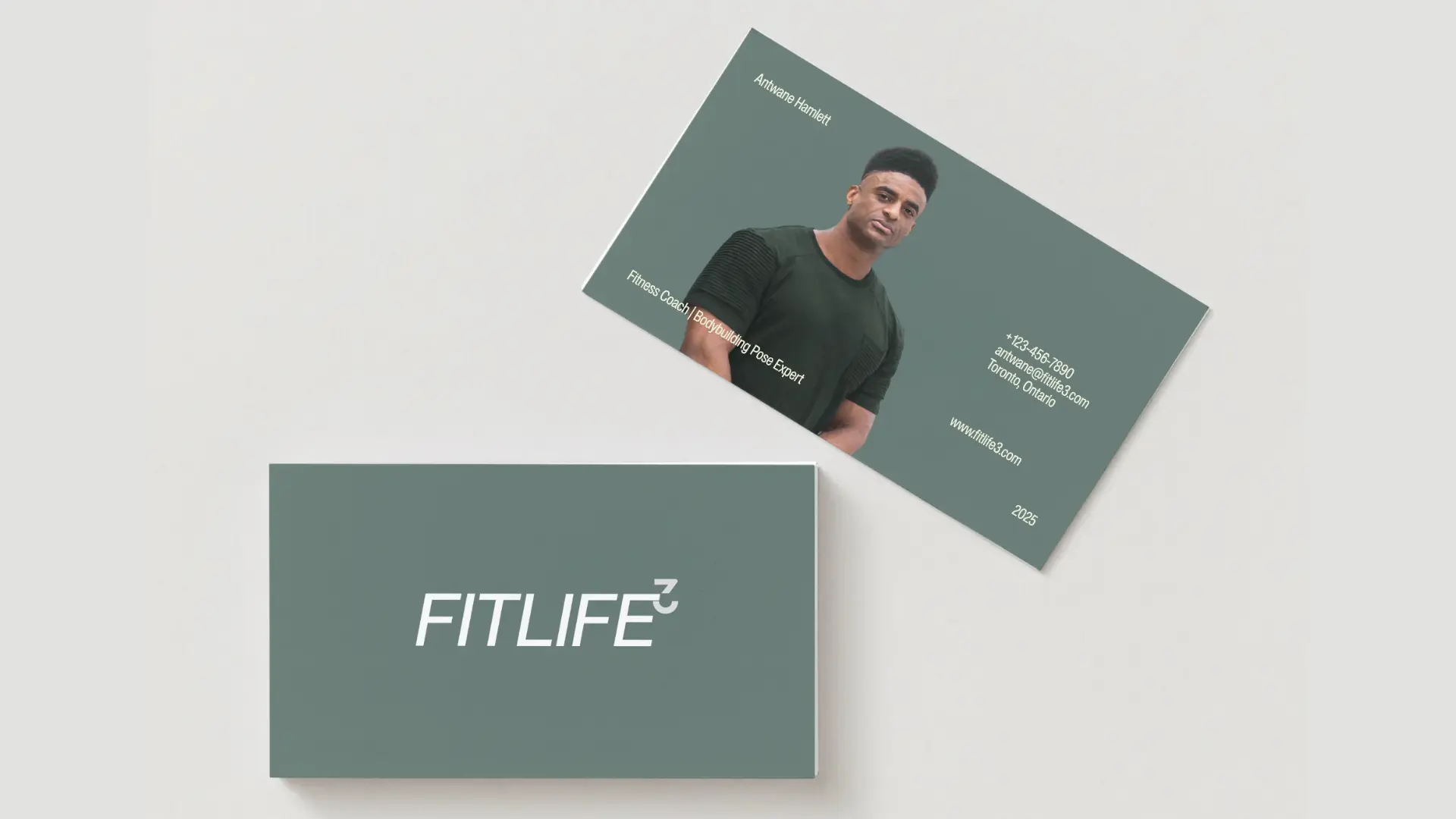
The result
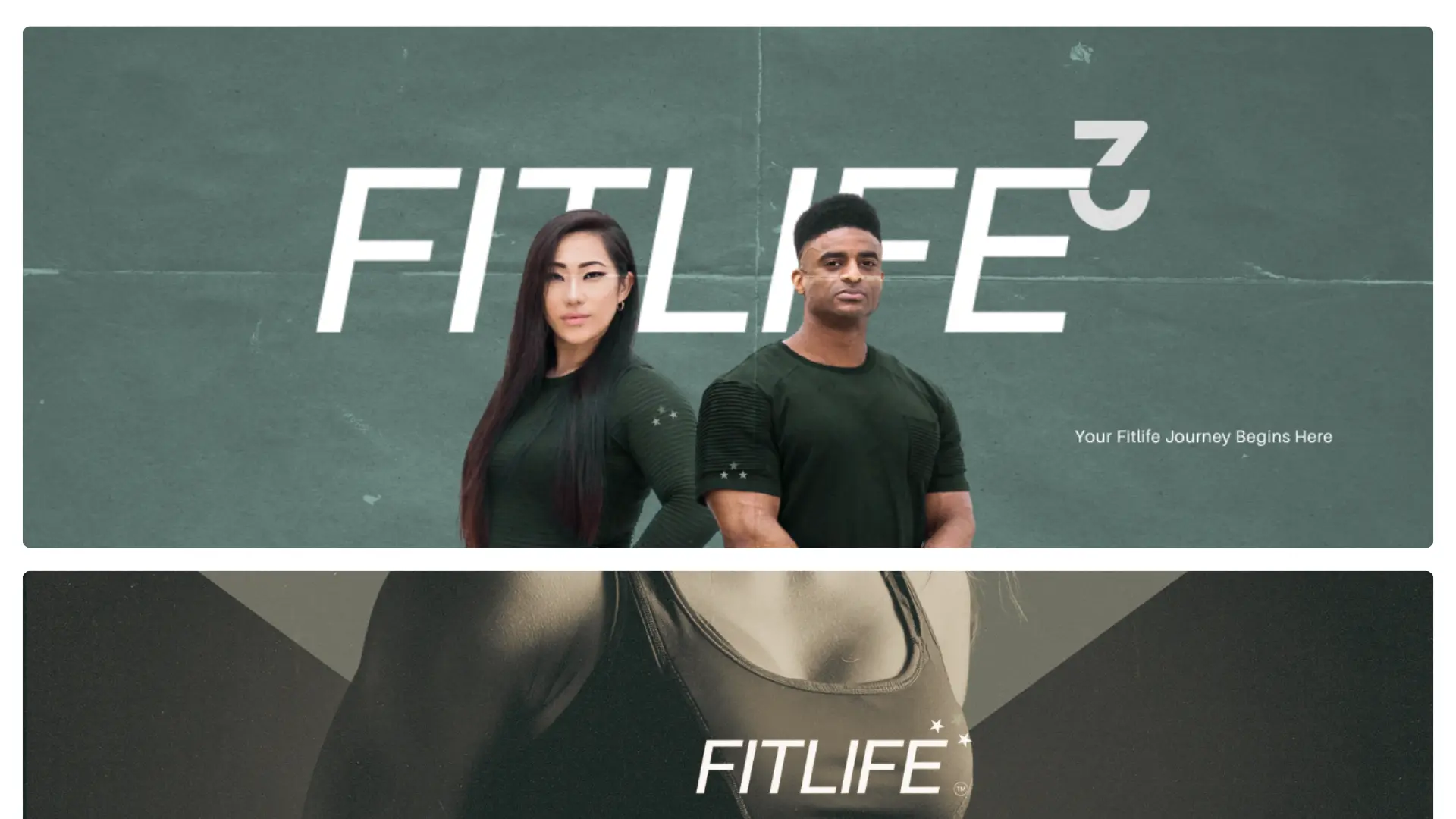
A flexible brand now connects coaching, community, digital programming and apparel with one composed, recognizable point of view.
Next project
Civic & community · Brand identity