Authority at a glance
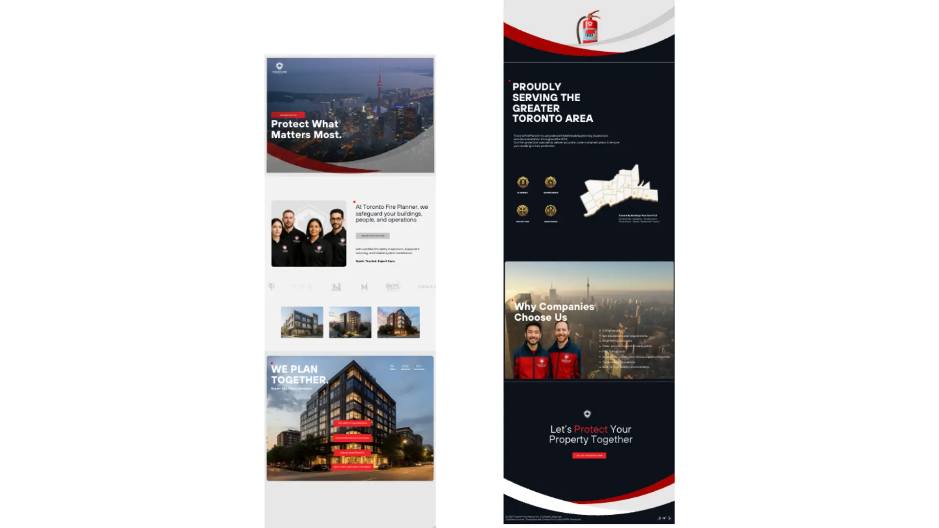
The shield and city cues create immediate recognition in a safety-critical category.
One Co. presents

The project
The work is technical and high-stakes, but the brand needed to feel accessible to property teams and decision-makers. Credibility had to arrive instantly without turning the experience into a wall of compliance language.
The idea
The shield and city cues create immediate recognition in a safety-critical category.
Structured layouts make technical content easier to scan, understand and act on.
Team imagery brings accountability and service to the front of the brand.

Colour language
Each colour has a clear role: an ownable foundation, a high-energy signal and a supporting neutral range that lets the brand move comfortably between expressive and practical moments.
Midnight#082637
Signal Red#E01D2F
Steel#AEB6BD
White#FFFFFF



The result
Toronto Fire Planner now looks as prepared as the service it delivers — consistent across its team, planning materials, property communications and digital experience.
Next project
Event identity · Campaign system