Quiet confidence
A restrained palette and generous composition let expertise speak without relying on volume.
One Co. presents
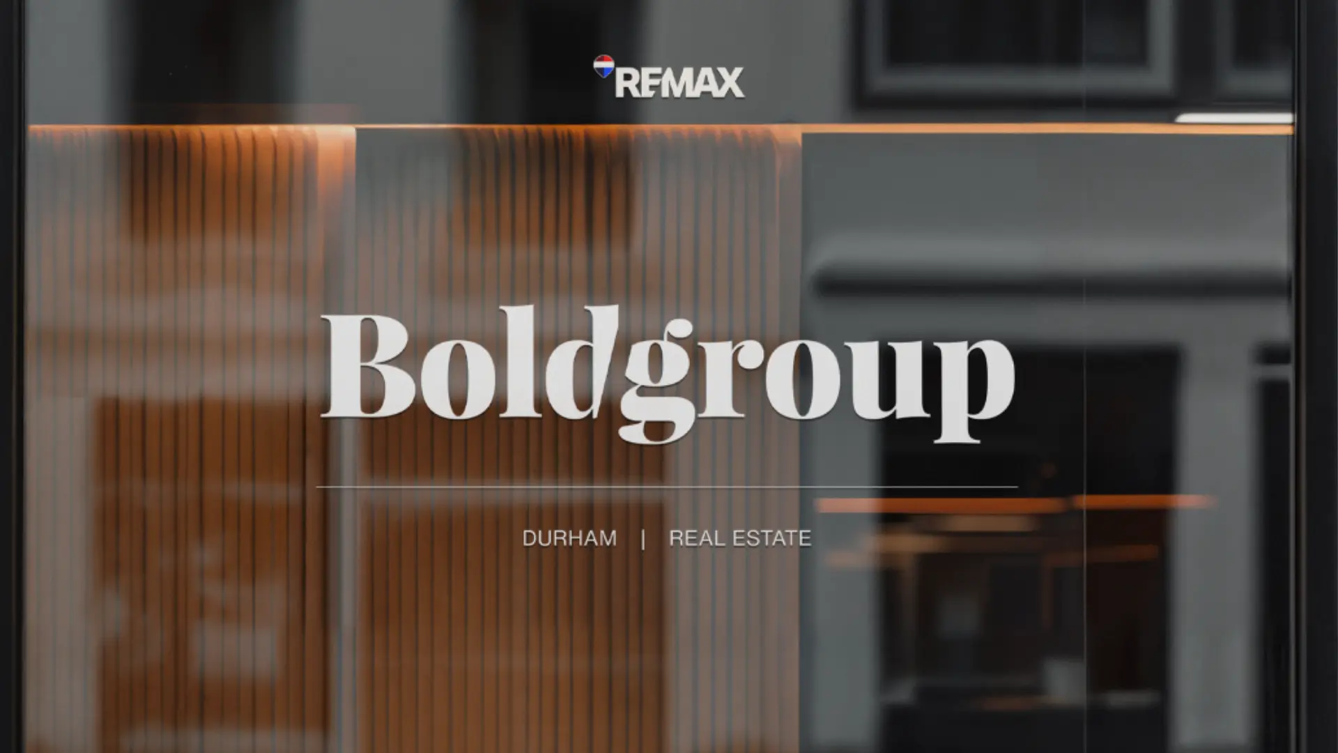
The project
Bold Group had expertise, reach and reputation, but its visual presence needed to communicate those strengths before the first conversation. The opportunity was to move beyond familiar real estate conventions and build a brand with editorial confidence.
The idea
A restrained palette and generous composition let expertise speak without relying on volume.
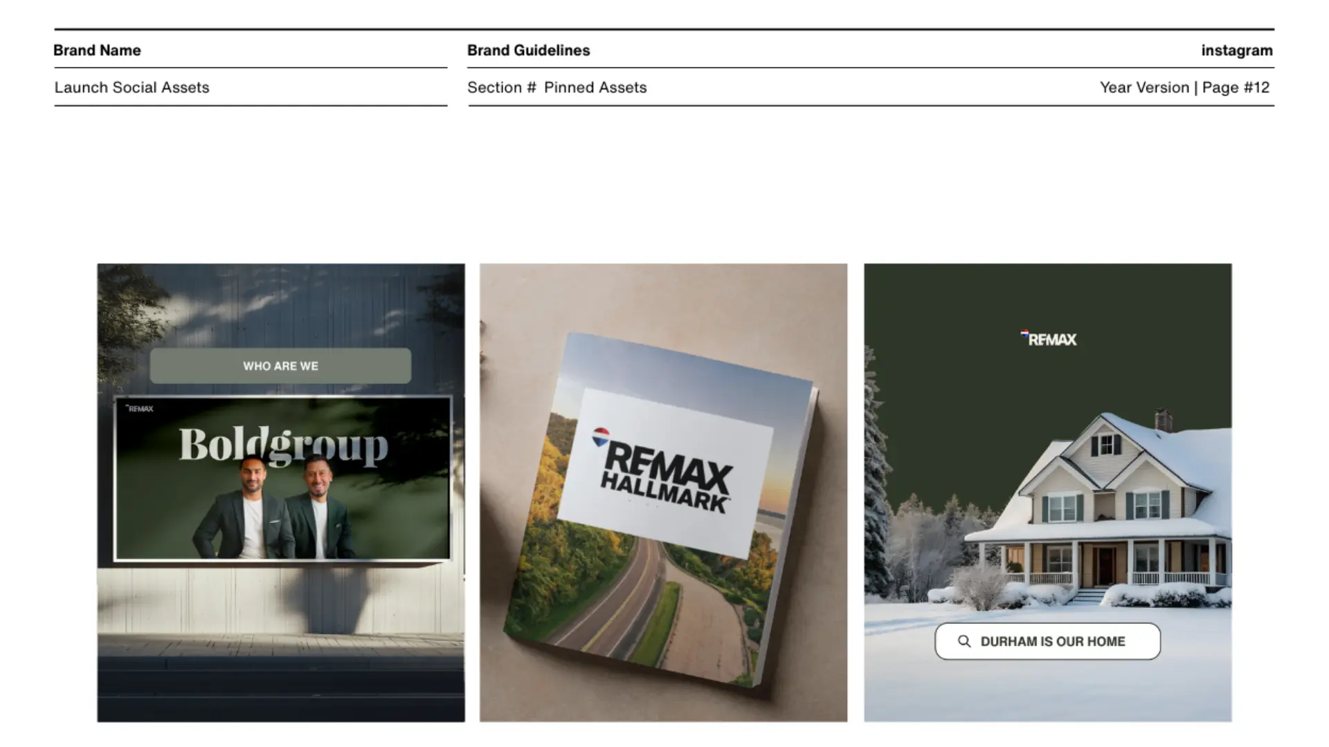
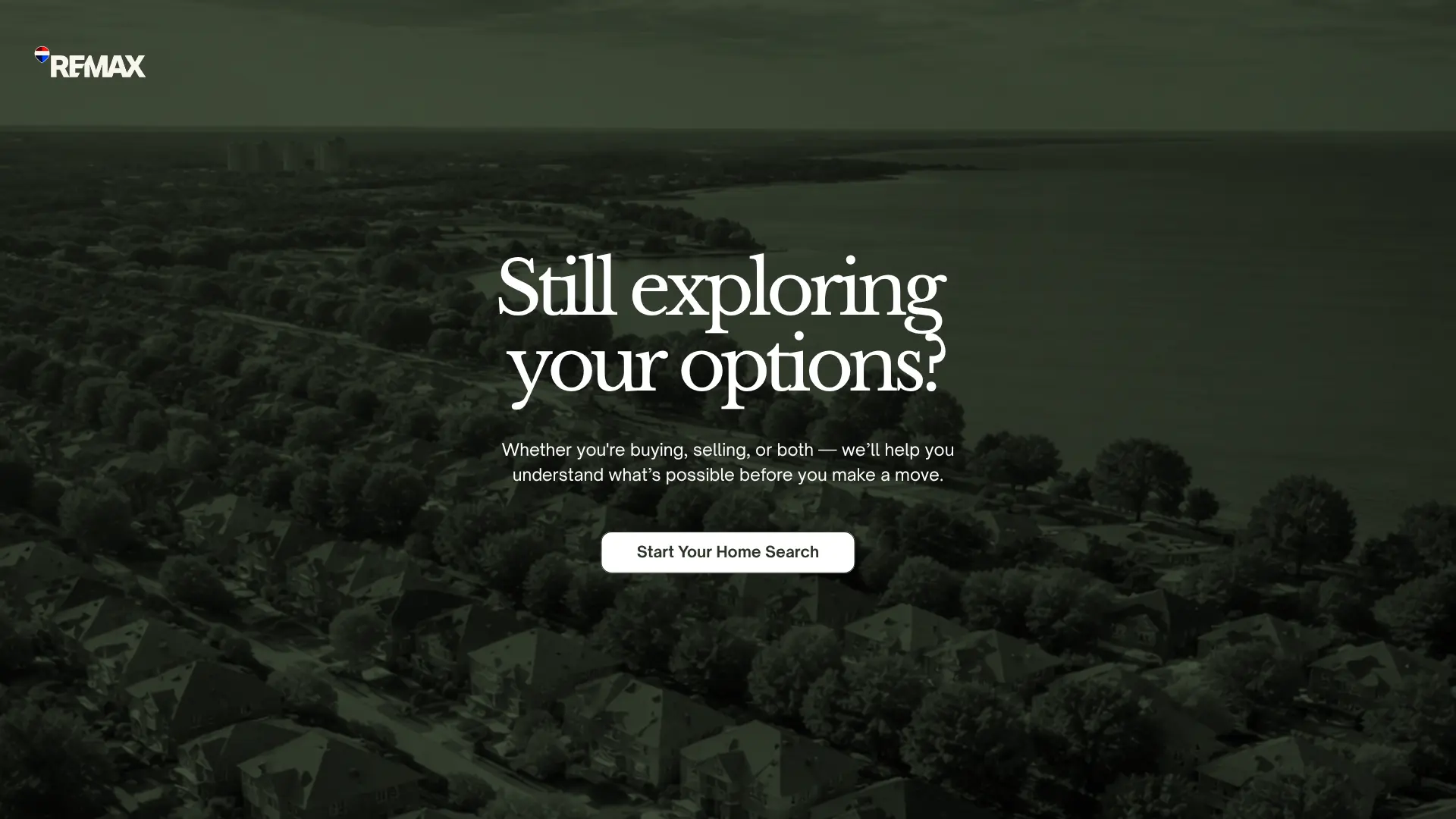
Durham is treated as a living context, not a sales territory, grounding every message in local understanding.
Portraiture and direct language shift the focus from transactions to the relationships behind them.
Colour language
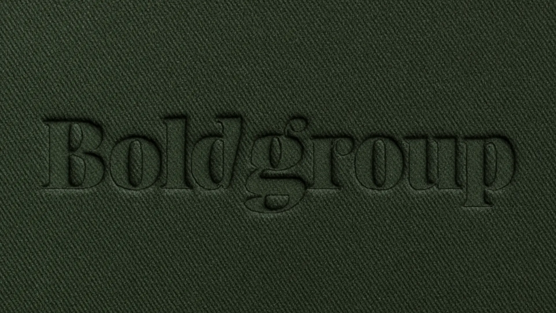
Each colour has a clear role: an ownable foundation, a high-energy signal and a supporting neutral range that lets the brand move comfortably between expressive and practical moments.
Evergreen#11251D
Warm Stone#D8CFC1
Copper#A86E43
Paper#F5F2EC
The result
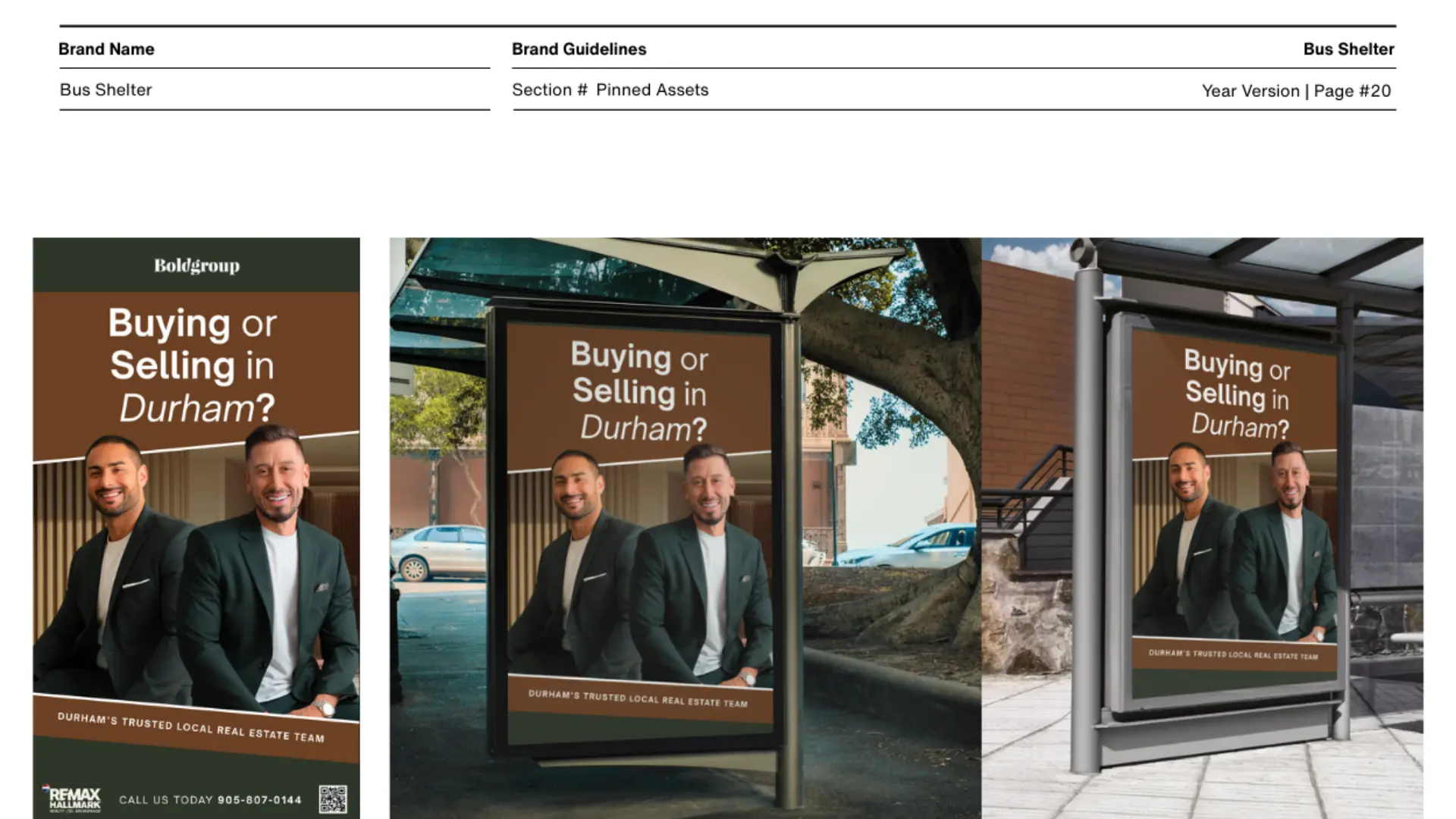
The new system creates one recognizable presence across listings, campaigns, environmental media and digital touchpoints — premium enough to lead, personal enough to trust.
Next project
Health & performance · Rebrand