Warm precision
Clean structure communicates expertise while soft colour and natural light reduce visual tension.
One Co. presents
The project
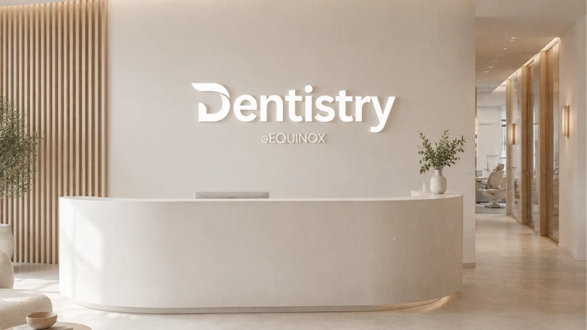
Dental care is personal, but the category often feels cold or overly technical. Dentistry @ Equinox needed to communicate professional expertise while creating an atmosphere patients could feel comfortable entering.
The idea
Clean structure communicates expertise while soft colour and natural light reduce visual tension.
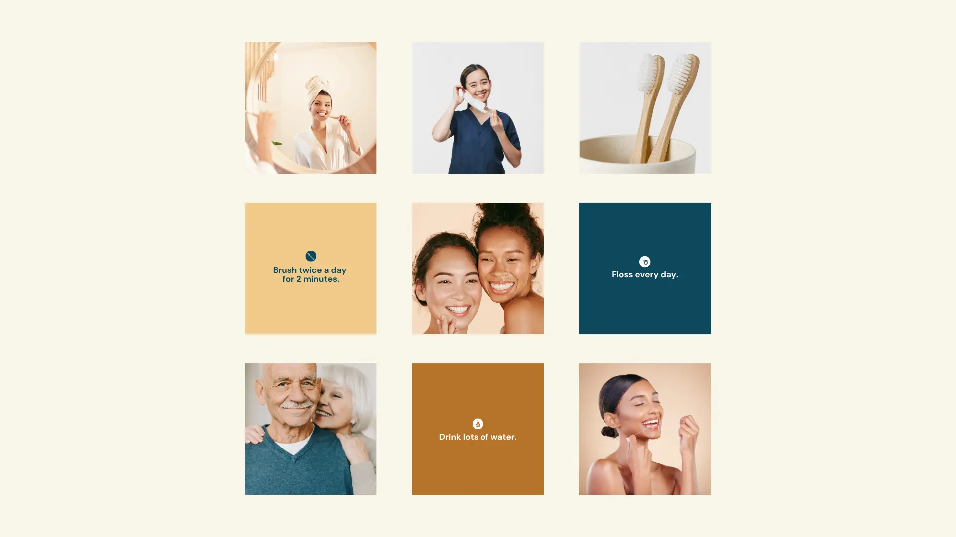
Inclusive, joyful photography places real emotional outcomes ahead of procedures.
Space, simplicity and plain language make the experience easier to navigate.

Colour language
Each colour has a clear role: an ownable foundation, a high-energy signal and a supporting neutral range that lets the brand move comfortably between expressive and practical moments.
Equinox Teal#115064
Soft Cream#FAF7ED
Sunrise#EAB474
Clay#B87543



The result
The practice now has a cohesive environment across signage, social content and patient communication, making care feel consistent before, during and after every visit.
Next project
Safety & compliance · Rebrand