Speed without friction
Short messages and generous hierarchy make the value instantly understandable.
One Co. presents
The project
Quiqx Pay needed to make a fast-moving financial product feel both effortless and dependable. The identity had to speak to ambitious businesses without borrowing the visual clichés of traditional banking.
The idea
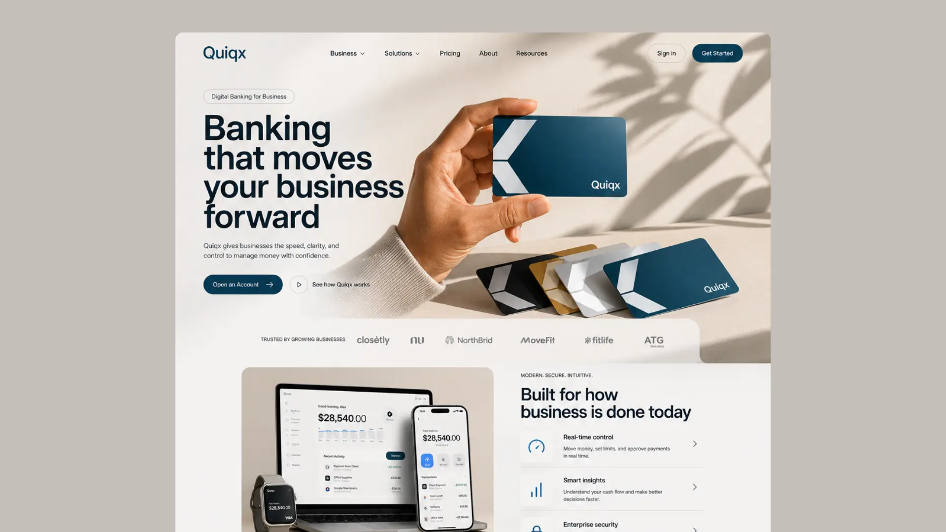
Short messages and generous hierarchy make the value instantly understandable.
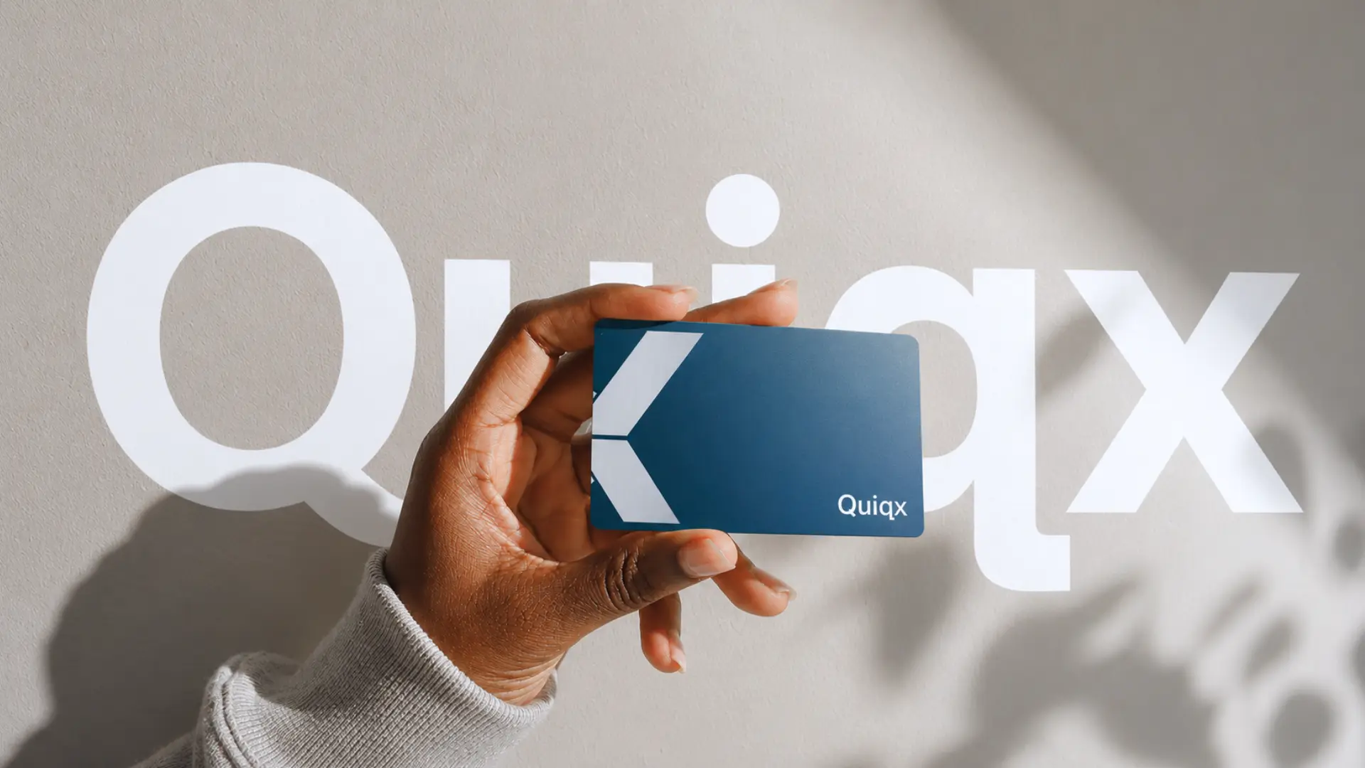
Tactile card imagery turns an abstract platform into a tool business owners can picture using.
A disciplined palette and timeless typography balance innovation with financial trust.
Colour language
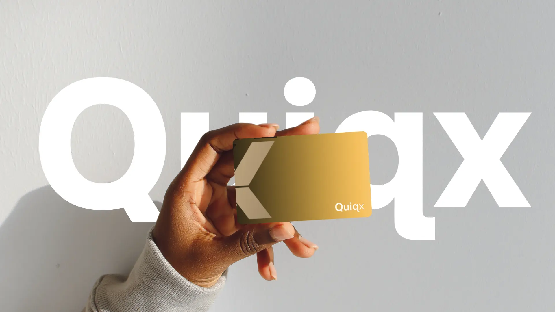
Each colour has a clear role: an ownable foundation, a high-energy signal and a supporting neutral range that lets the brand move comfortably between expressive and practical moments.
Quiqx Navy#12334D
Forward Gold#C89B39
Cloud#D6D2CC
White#FFFFFF
The result
The result is a clean financial brand designed to scale from a physical card to a complete digital platform while keeping every interaction clear and recognizable.
Next project
Real estate · Brand transformation